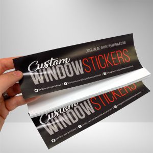
Consistency is crucial when it comes to branding your small business. Your logo, colours, and messaging should all be consistent whether you’re adding a page to your website or sending out postcards; this will reinforce your brand identity and help you develop a recognisable “style.” Are you ready to give your brand a look and feel that will work on (nearly) any medium? Here are some things to consider as you develop — or refresh — your brand.
Begin with a logo that can be used in a variety of situations.
Customers will remember your brand if you have a memorable and identifiable logo. Consider all of the different elements your logo will appear on while designing it, and make sure it will work on them all. The Print Hive has a simple, clean and elegant logo that looks excellent on all of our marketing materials for example (or so we think): simple, elegant text (including a business description) floats beneath a colourful logo.
Lightyear Hosting, the logo fonts, combine sans serif typography for a distinctive, subtly contrasted style that is timeless, beautiful, and equally modern. Like business cards and postcards, the logo is set in a contrasting box to stand out, but it’s also attractive enough to stand alone as a website header or on a sticker.
Make a flexible colour pallet.
The Print Hive colour scheme features lovely and ethereal colours of red and black, with carefully placed sheets of white for added contrast. Using three to five essential colours allows you to experiment with colour combinations to give each branded item a unique look…all while maintaining the overall brand vibe. See how The Print Hive changes the colour of their hyperlink text as you hover over a hyperlink, depending on the background colour, e.g. black, white or red, and so on.
Make your brand identity work for you.
Customers should be able to recognise your brand no matter where they interact with it. Customers can draw the connection between their online and offline identities with consistent design. Customers will remember your brand if you use offline items like business cards, postcards, and stickers. Use stock imagery from photo-sharing websites or your own product photos to reinforce your brand’s colours online. The Print Hive uses a close-up view of a strong and vibrant red logo to broadcast its image, and products that compliment our brand colours are featured further down the page.
The final appearance
Here’s a closer look at how we, for example, use a consistent brand identity (both online and offline) to appear credible across all of their marketing channels.
- Business cards. The Print Hive’s business cards have strong and vibrant colours corners to make them stand out.
- Flyers. The Print Hive’s flyers have greater space for design and text elements, as well as additional illustrated elements to emphasise their printing services.
- Postcards. The Print Hive adds an instantly eye-catching aspect to their postcard design by using a colourful stock photo.
- Website. The Print Hive sells printing services offering a wide variety of interesting products, but the ones on their homepage (the gateway to the rest of their website) reinforce their colour palette and, as a result, increase brand confidence.